
|
|
|
|
GOAL
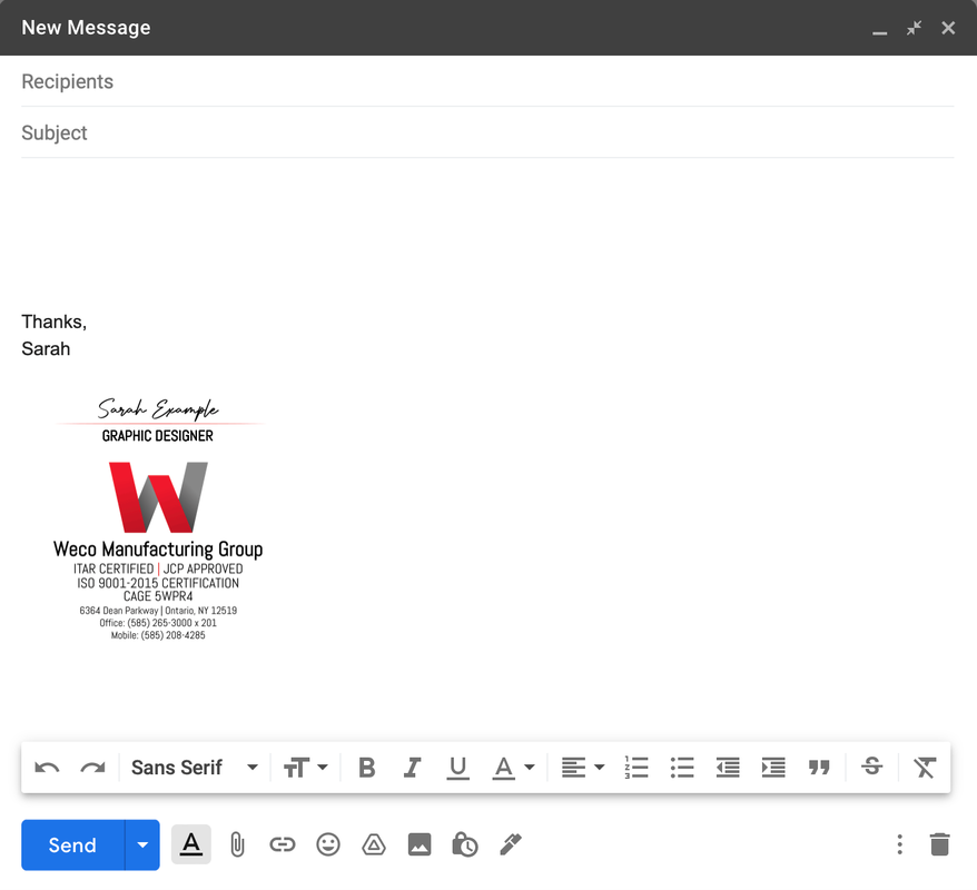
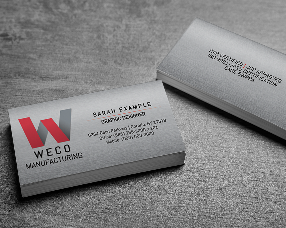
The logo they provided me looked more like a radio station logo than one for a manufacturing company. I wanted the updates to better align with their industry. They also needed an update to the company email signature so that everyone had the same design.
|
ELEMENTS
Logo, Business Card, Signature Design
|
|
|
SOLUTION
The original color scheme was working well so I kept the red with grayscale. I did research on other manufacturing companies in their area and made note of the styles that were being used. I wanted to fit the industry but I also wanted them to stand out against the crowd. Once I got the logo designed, I used the same styles to create the email signatures. I used a scripted font for the name to mimic a handwritten signature with a sharp san serif font to use for the contact information.