
|
|
|
|
GOAL
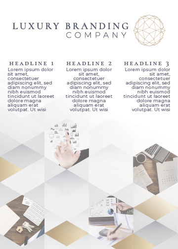
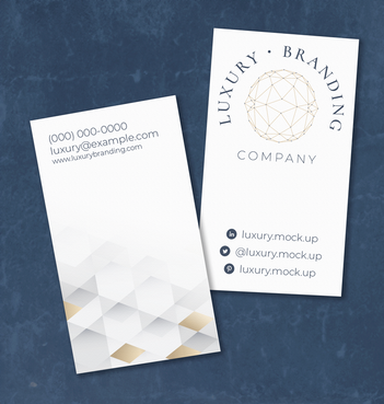
The idea was for a gem-shaped icon with an elegant typeface. I wanted the brand to show professional luxury. I compiled a long list of other things that I thought the owner would like or dislike and why.
|
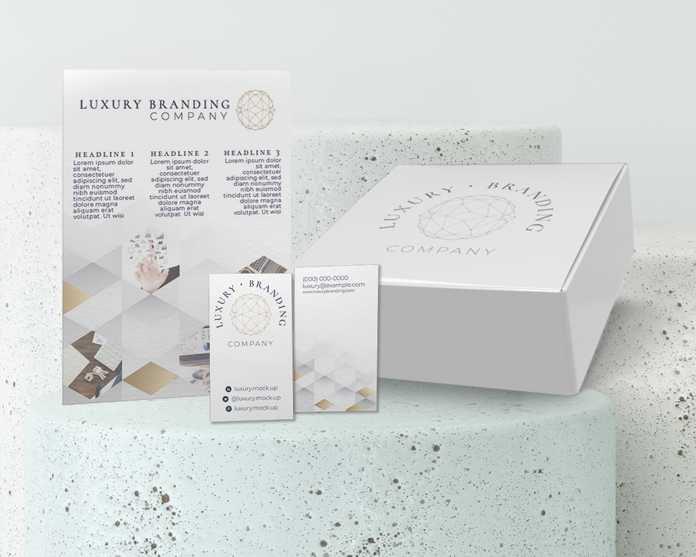
ELEMENTS
Logo, Mood board, Business Cards, Promotional Postcard
|
|
|
|
SOLUTION
I went back and forth a lot with the logo, it was harder to design without direction than I thought it would be. I tried to match everything on the list when I should have pulled the more important aspects of my concept brainstorm. I went back in and added the dots on each of the anchor points so that it was a bit more abstract. I was able to really play around with a style that I didn't have a lot of experience in.