|
GOAL
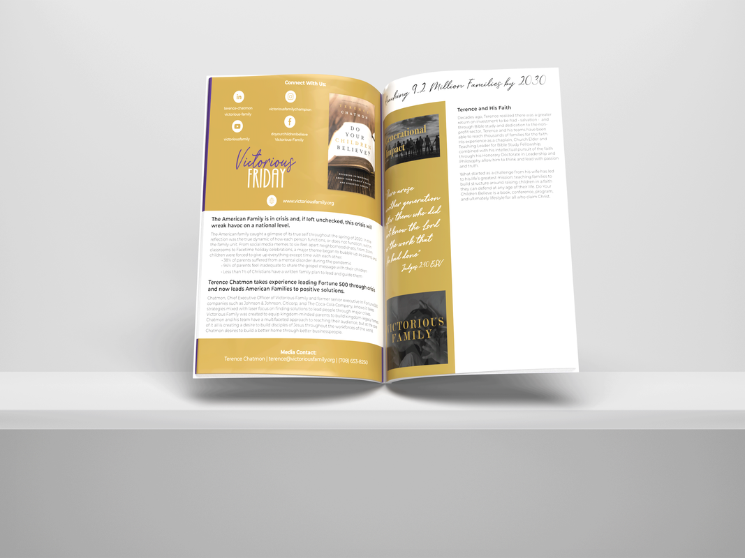
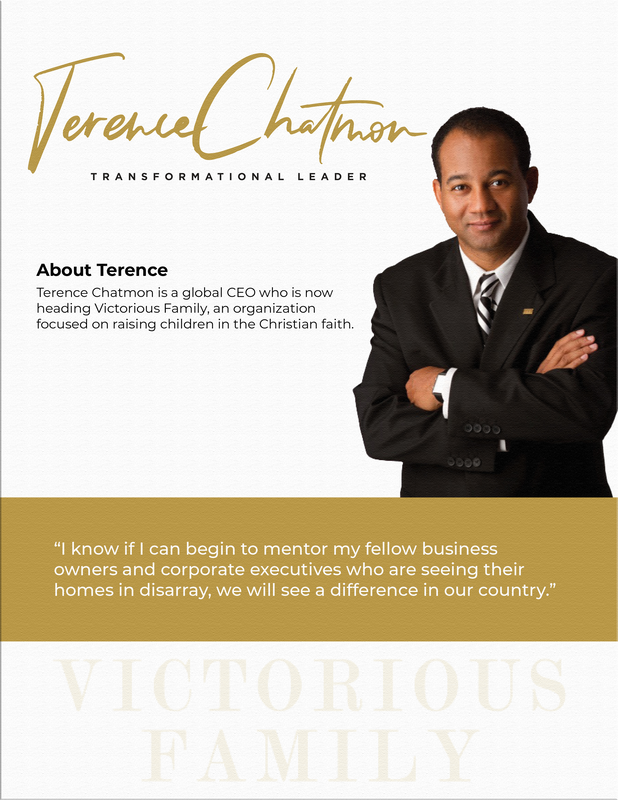
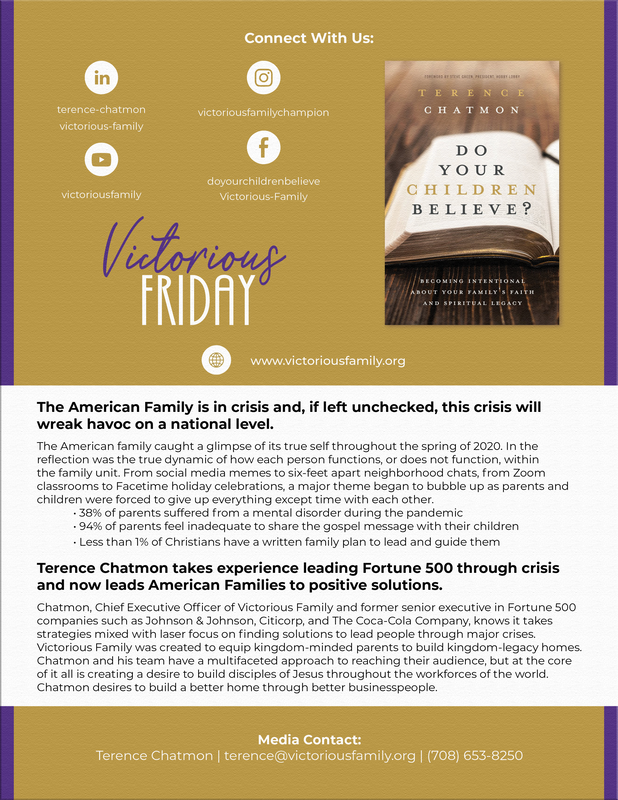
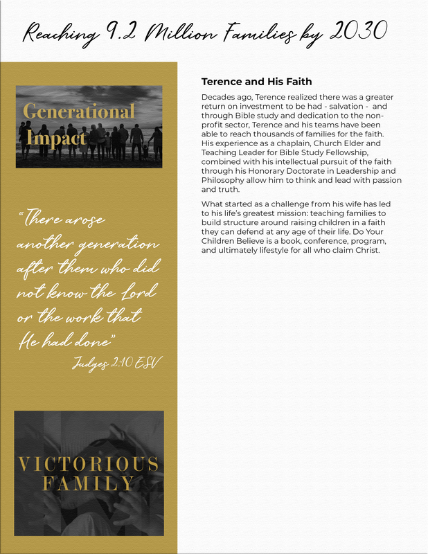
I was hired by an agency to do work for a Christian religious group that focused on raising children in the Christian faith. I was only given a logo, a few images that the group had previously used, and a small creative brief to create a 3-page media kit for the client to send out when people inquired about his organization, Victorious Family. The client wanted to focus on families for his clientele while keeping a modern or "fresh" look. The references I was given to work off of were far from modern so I had to find a cohesive design based on what he liked and what I knew would draw families in. I didn't have a lot to work with so I chose to send multiple versions of the first page to get a feel for what he was really looking for.
|
ELEMENTS
Logo, Live Social Promos, Media Kit
|
SOLUTION
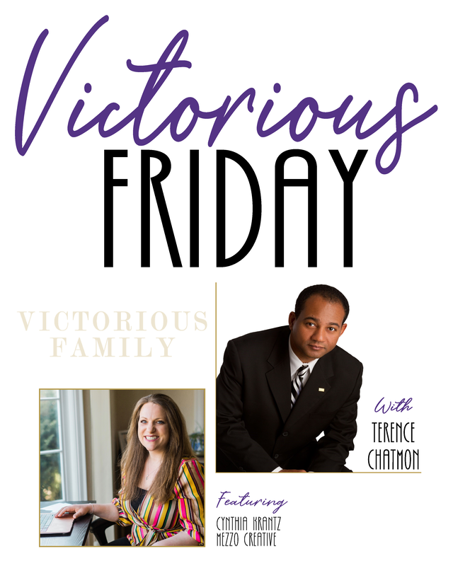
I chose to design a new logo for the new event for Victorious Family because I thought that it would be hard to differentiate the two logos if I used the same typeface/style. Once I got this done and after a bit of back and forth with the client and his team, I was able to come up with a design that had a nice balance of modernism to add to the previous images used. Unlike what was given to me, I wanted to use a lighter background and set of colors to give it a softer feel to appeal to the families he was looking to join. I kept the gold from the original logo to keep a little consistency then chose to add purple to give the design an old-time royal mood that would bring light to the religious side of the content.

