|
GOAL
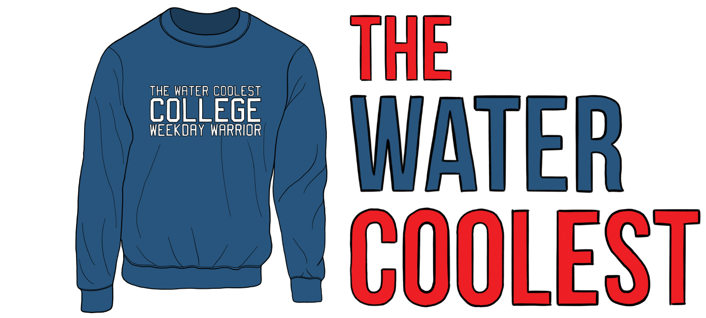
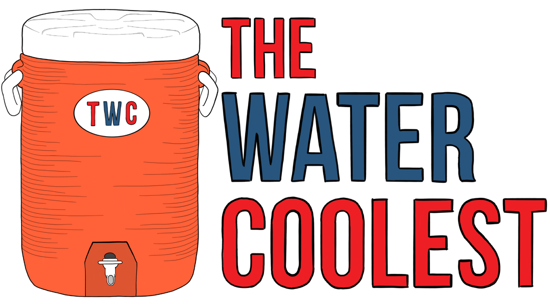
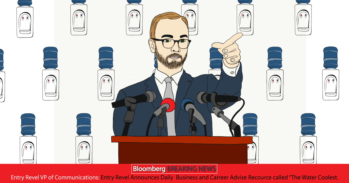
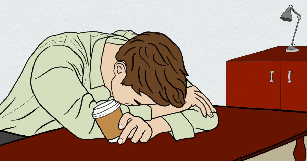
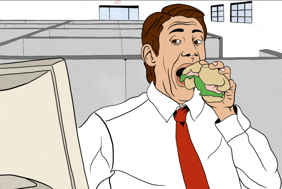
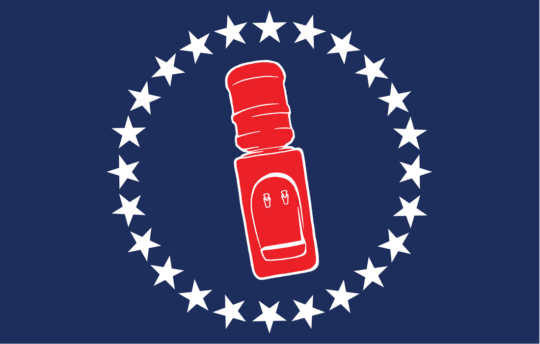
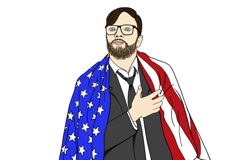
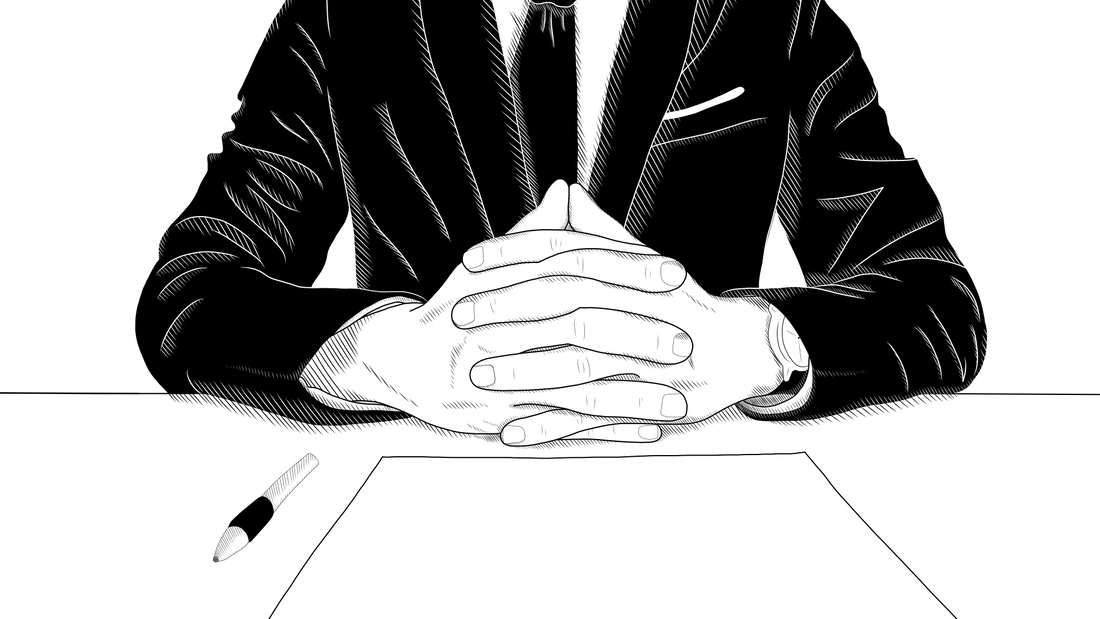
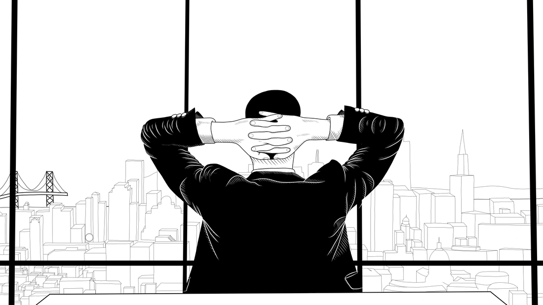
The then-startup company needed a logo to get their branding started, The client wanted a hand-drawn illustration of a typical office water cooler with a bold typeface. After creating the logo I created the graphics that were used for different sections of the newsletter. I also created illustrations of each member of The Water Coolest Team for the website. When the company became more popular, I was assigned to create illustrations for the merchandise that they started selling.
|
ELEMENTS
Logo & Variations, Writer Illustrations, Promotional Illustrations, Product Illustrations
|
SOLUTION
This was the first set of illustration-based projects that I had ever done. After a few tries on Illustrator, I went out and bought an iPad to master the style that the client was looking for. I decided on using an illustrated version of a bold typeface and was able to achieve exactly what they were looking for. I used the same technique of illustration to implement the rest of the work for the company and in the fall of 2021, Barstool purchased the Water Coolest and besides adding a barstool element to the logo, the branding remains the same.

