|
GOAL
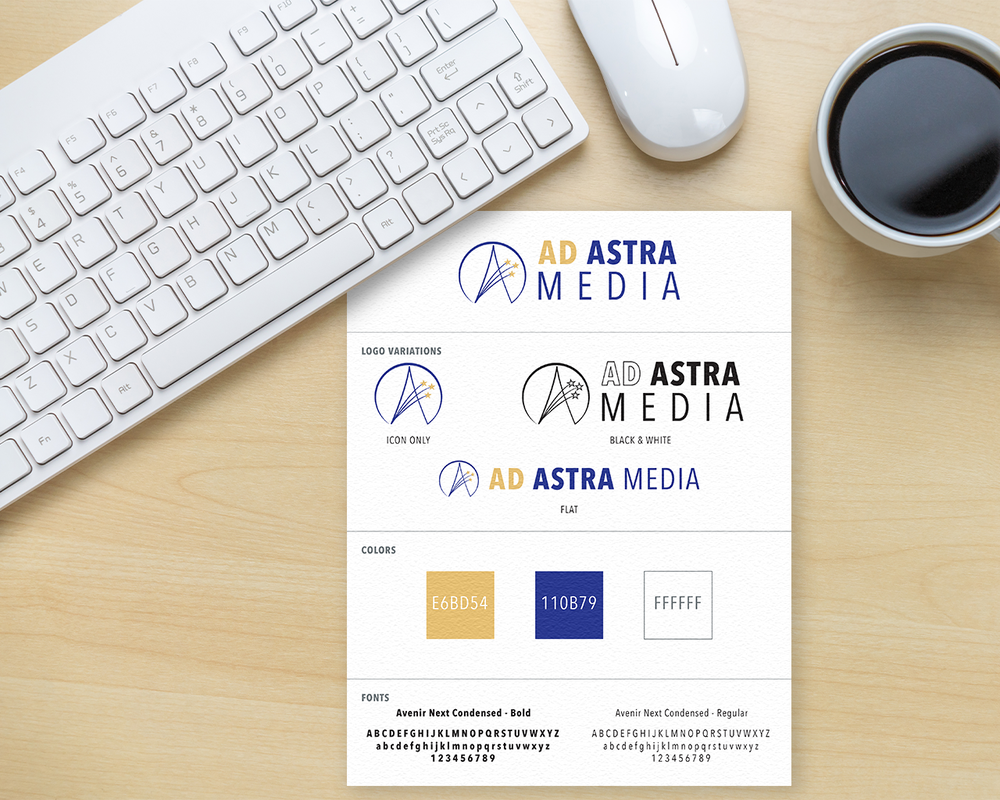
The clients had the name of their company picked out and needed a logo to represent them. They wanted to have a space theme to go along with the “astra” in their name but weren't sure about color or typography. They also definitely wanted part of the logo to be an icon that would be recognized without the text.
|
ELEMENTS
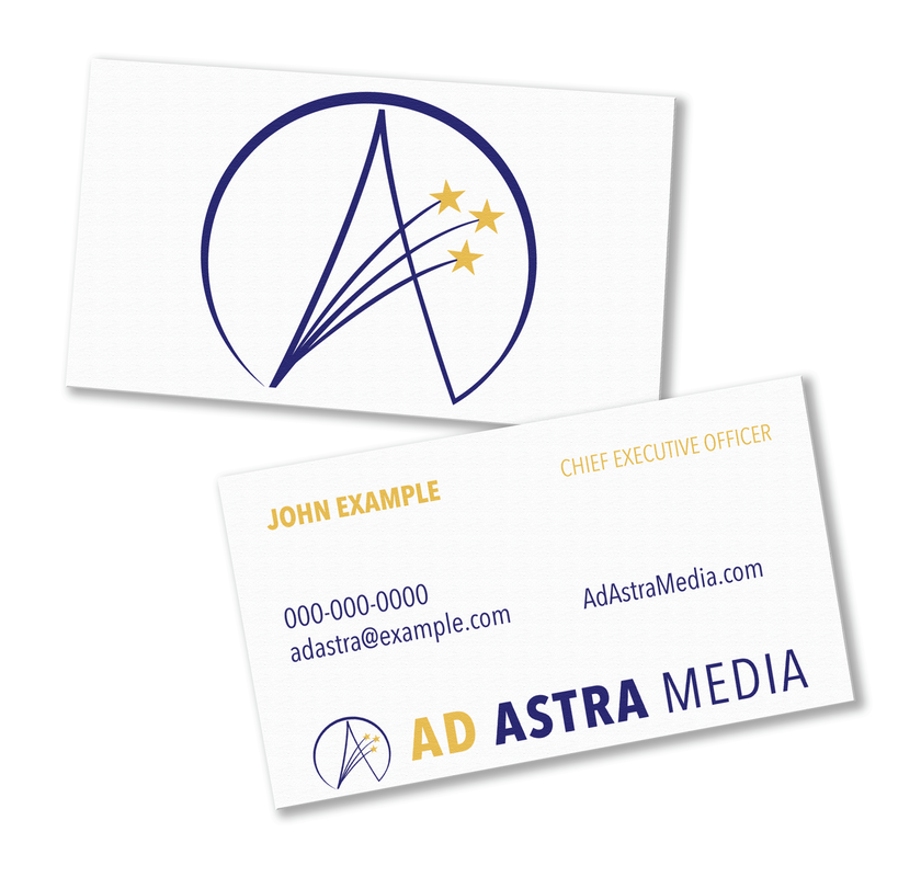
Logo, Media Kit, Business Card
|
SOLUTION
I started with typography and sent over a few combinations that I thought would be a good start. From there I worked on an icon that would stand out. To stay within the space theme I decided on a basic star as my starting point. I had another option with more intricate designs but they ended up choosing my first draft. Next was the color scheme. I felt that the colors had to stay within the space realm as well but I didn't want to use anything too loud because it was off-brand for a media company. In the future, we plan on continuing work when the company needs to add to its branding.


